Travel Guides on Your Phone Are Now Map-First
Open any ChicTravel guide on your phone and the destination map now fills your screen, with the magazine-style guide riding a swipeable sheet on top — the same feel as our mobile app. Here's what changed and how to use it.
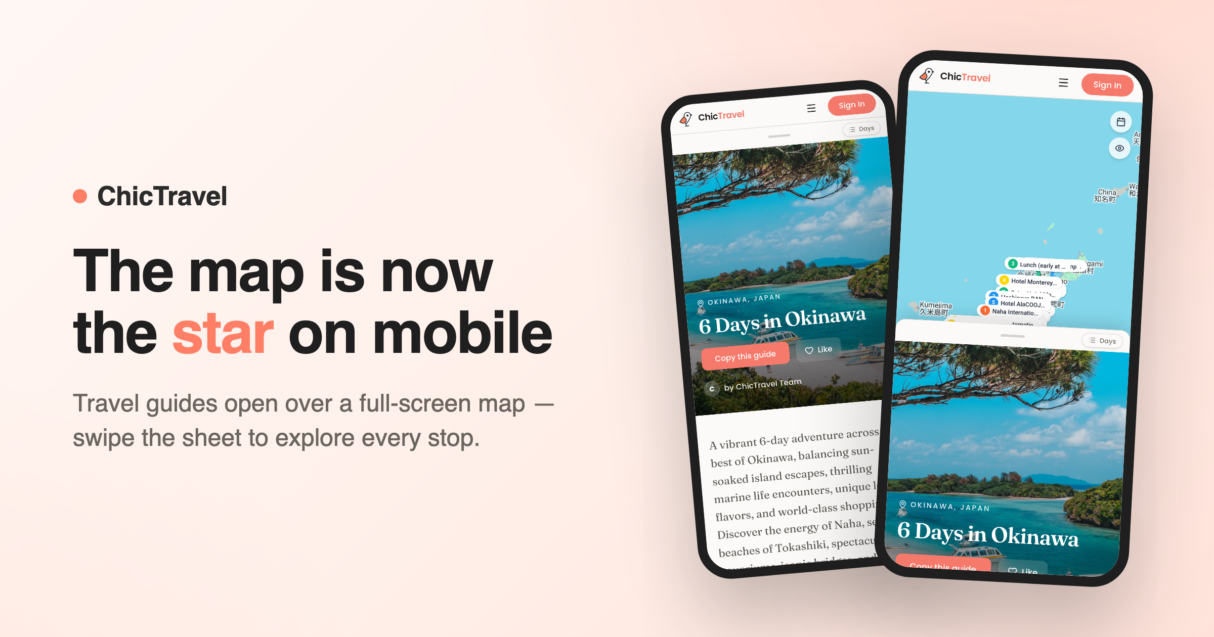
A travel guide is really two things at once: a story you read and a map you navigate. On a desktop we can show you both side by side. On a phone, something had to give — and until now, it was the map, tucked away in a band below the guide where most readers never found it.
That changes today. Open any guide on your phone's browser and the destination map fills the screen edge to edge, with the guide itself riding on a sheet you can swipe up and down — exactly how trips already work in the ChicTravel mobile app.
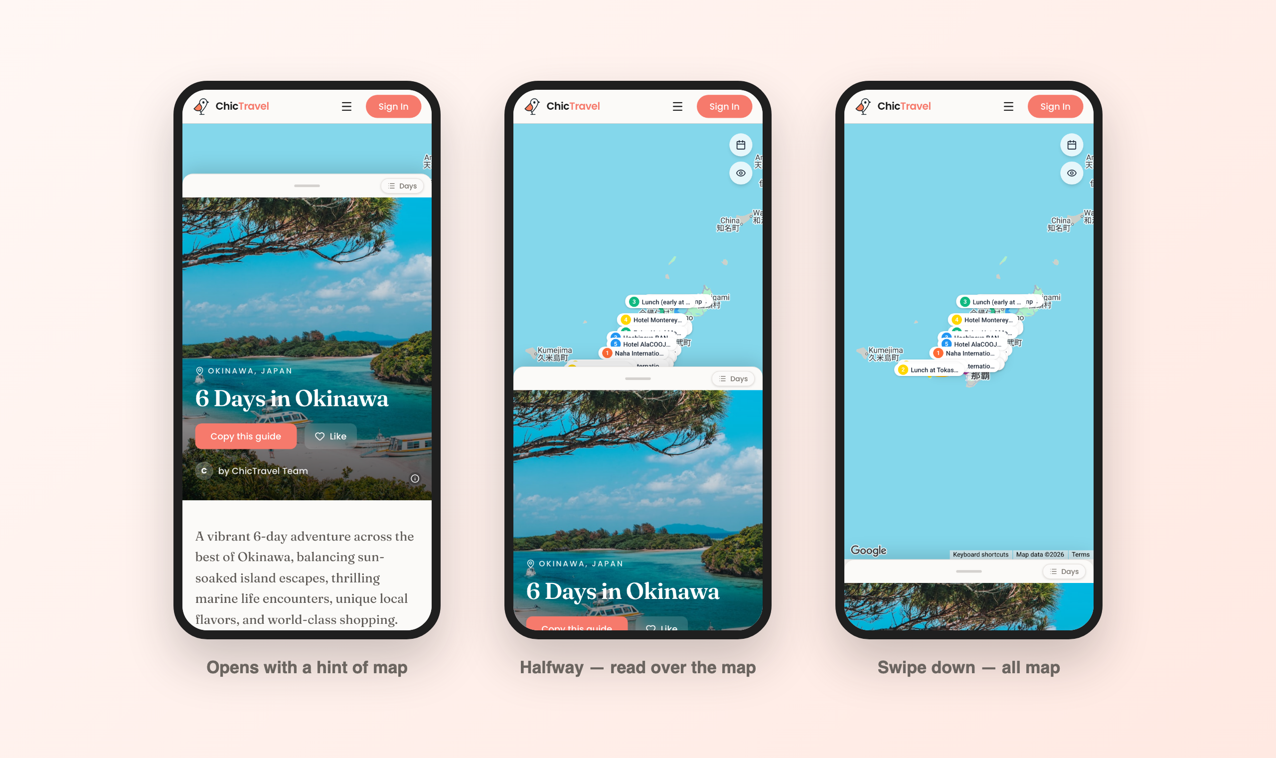
One gesture, three views
When a guide opens, the sheet sits just shy of full height, with a sliver of live map peeking out above it — your hint that there's more underneath. Grab the handle and pull down: at halfway you're reading the guide and watching its stops on the map at the same time. Keep going and the sheet tucks into a slim bar at the bottom, giving the whole screen to the map so you can pan around the neighborhood, tap pins, and get your bearings.
Fling the sheet back up and it docks neatly under the header for full-screen reading. Wherever the sheet sits, the guide keeps scrolling normally inside it — you never have to choose between reading and seeing where you are.
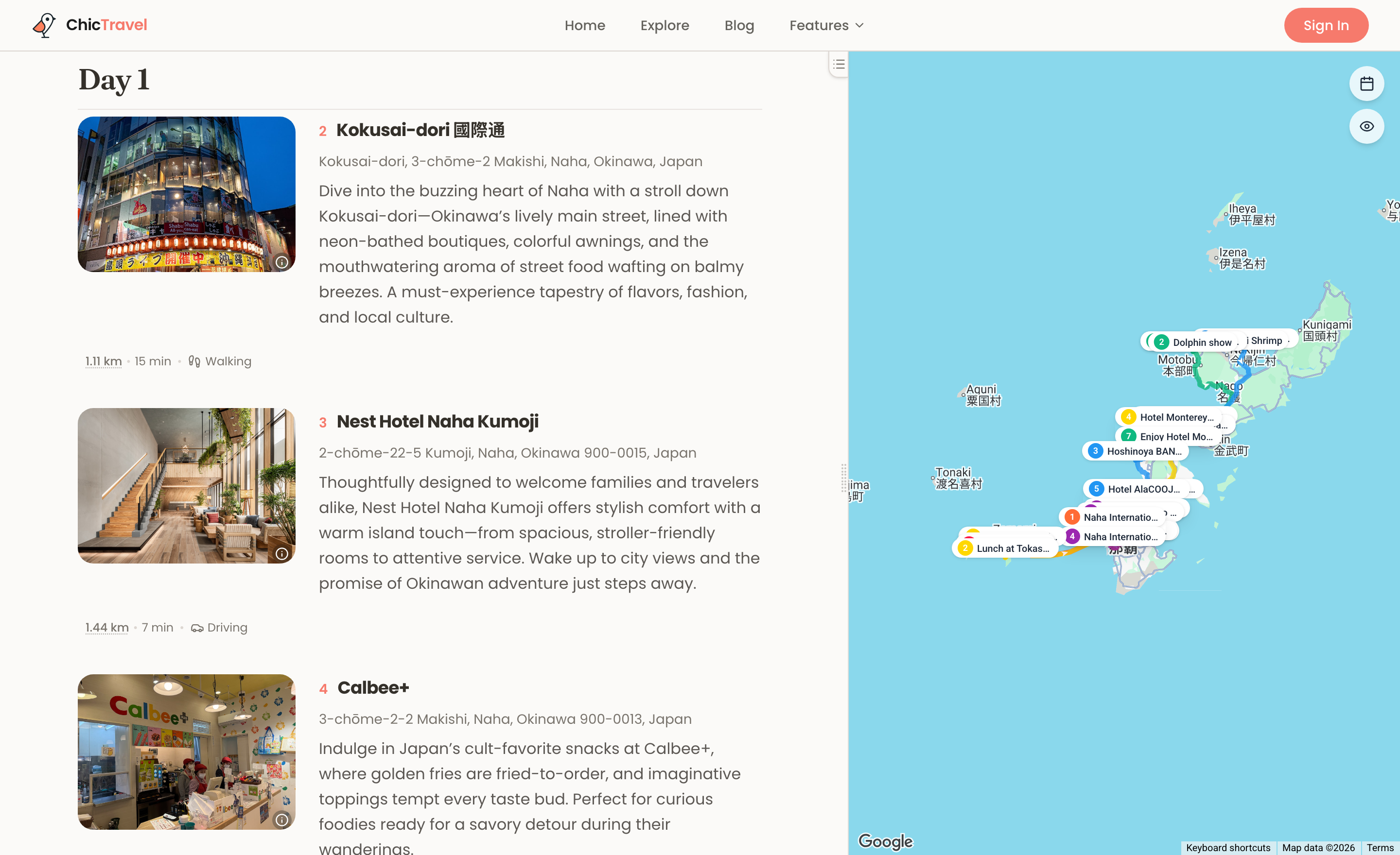
A guide that reads like a magazine
The guide living on that sheet got a redesign of its own. Guides on ChicTravel are laid out like a travel magazine feature: a full-bleed cover photo with the title set over it, a typeset introduction in an editorial serif, and then each day as its own chapter — a bold dated header that stays pinned while you read down the day.
Within each chapter, every stop is a numbered entry with its photo, address, and the author's notes, and the connective tissue between stops — the ten-minute walk, the short drive — is printed right between them, the way a good guidebook would. No planner chrome, no edit buttons, nothing between you and the story of the trip.
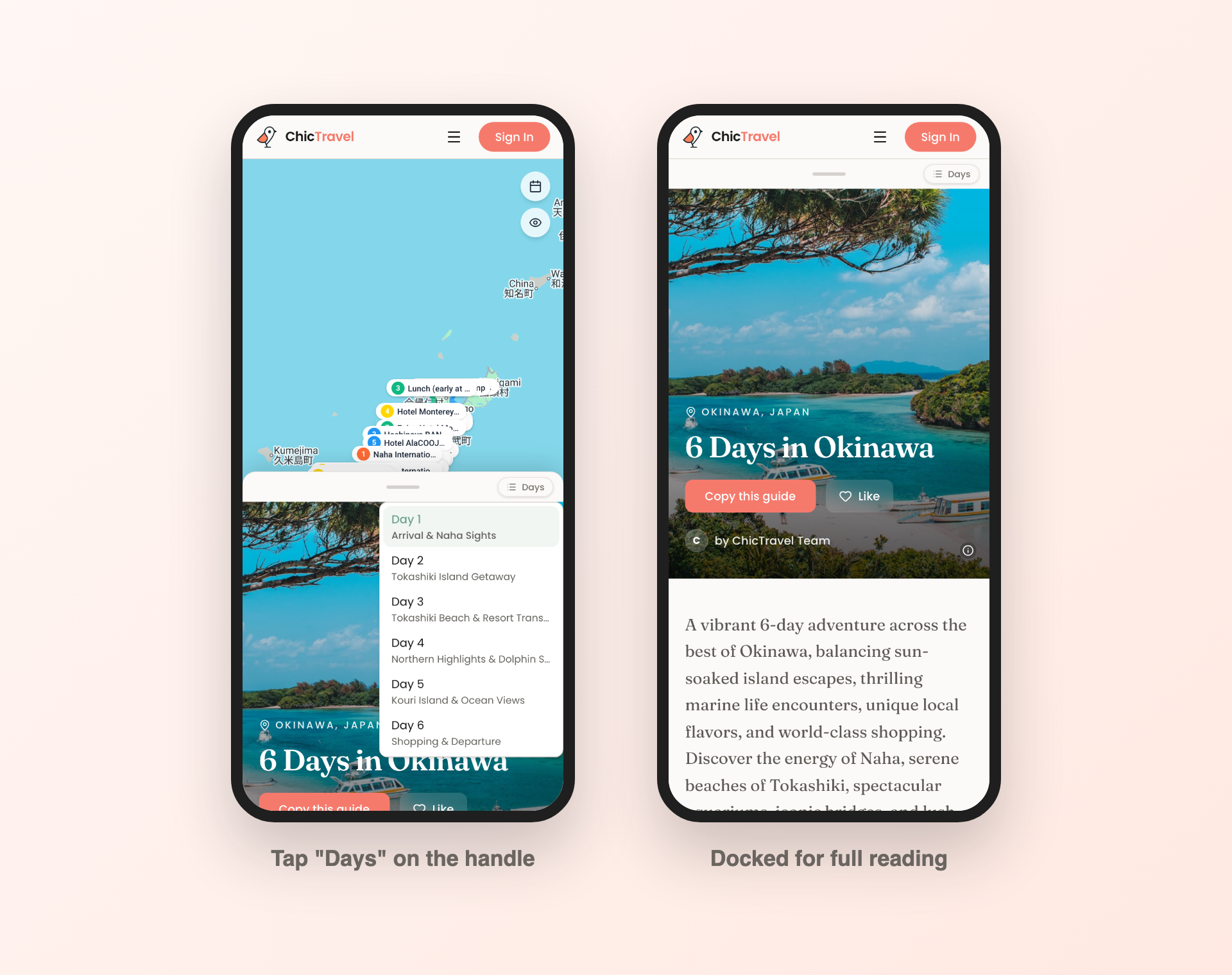
Jump straight to any day
Long guides got a shortcut, too. The little "Days" pill riding the sheet's handle opens a list of every day in the guide — tap one and the guide glides right to it, with the day's title landing at the top of the sheet. It's the same jump-to-day control desktop readers have next to the map, redesigned for thumbs.
Small touches round it out: the map's filter buttons stay out of the way until the map actually has room to breathe, the sheet's corners square off when it docks, and a quick flick snaps it crisply between positions.
Why map-first?
Because that's how guides get used in the real world. At home you read a guide top to bottom; on the street you ask "what's near me right now?" — and that's a map question. Putting the map under everything means the answer is always one swipe away, whether you're skimming a friend's Lisbon weekend or retracing a creator's food crawl in Bangkok.
It also brings the web experience in line with our mobile app, where trips have always been a sheet over a living map. If you've planned a trip in the app, your hands already know how this works.
Try it on your next guide
Grab your phone and open any guide from the explore page — no account needed. Pull the sheet down, wander the map, and when a guide feels like your kind of trip, "Copy this guide" turns it into an itinerary you can edit, right from the hero. Happy wandering.

